There are two types of bar graphs which can be provided in the Describe image question type. One is horizontal and second is vertical bar graph. In bar graph either the student has to illustrate the upward or downward trends or has to compare the data in terms of highest and lowest. This blog will uncover the tips and strategies and few sample answers which will help the test taker to boost the score in DESCRIBE IMAGES.
PTE Bar Graph Structure:
Introduction (3-5 Seconds)
- Provide the brief overview of the given graph.
Explanation (18-22 Seconds)
- Identify Key points of X-axis and Y-axis, for instance years, units such as the values in percentage or millions of dollars
- Discuss Overall Trends: such as increasing, decreasing or fluctuation of the given values.
- Focus on the main data rather going through each and every figure
Conclusion:
- Highlight the overall changes without mentioning the data.
How to score high in PTE Describe Image: Bar Graph PTE
Bar Graph Explanation:
How to organize the response effectively:
Introduction
- Start the introduction with the title of the graph then move towards the X-axis and in the last Y-axis, elaborate these points in 12 to 15 words.
- Example: The bar graph illustrates the annual sales of Company X from 2010 to 2020, with the X-axis representing years and the Y-axis depicting sales in millions of dollars."
Explanation:
To best highlight the important details of the graph, use the following format:
- Trends: Note overall patterns, like steady increase, decline, or oscillations.
- Comparisons: Show contrasts between categories, years, or data points.
- Outliers: Note any data points which are notably different from the rest.
Example
"The bar chart indicates a constant increase in Company X’s revenue between 2010 and 2018, hitting its peak in 2018 before dropping drastically in 2019. The highest revenue was visible in 2018, with the greatest fall occurring in 2019."
Conclusion
- Summarize the main key point, for instance Overall Trend.
- Example: "Overall, the graph highlights consistent revenue growth until 2018, followed by a significant decline in 2019."
Note the 2-3 Key Points:
To be sure that you don’t miss the important key point, follow the following strategies:
Focus on Key Points
In order to effectively analyze the data, pay attention to the main points instead of reciting all the facts. A more polished version is as follows:
"The line graph shows a continuous increase in revenue up to 2018, after which there was a huge dip in 2019. The lowest point was in [year] which reflects an immense fluctuation period."
Usage of Linking Words and Phrases
Using linking words enhances clarity and coherence. Here’s an improved version incorporating them:
- "The graph shows a steady rise in revenue until 2018, followed by a sharp decline in 2019. In contrast, the lowest value was recorded in [year], highlighting significant fluctuations. Overall, the trend suggests a period of growth before a sudden downturn."
Follow the time limit:
- Try to cover all the main points of the graph within 35 to 37 seconds, exceeding the time limit may result into incomplete data spoken.
Learn Vocabulary:
Vocabulary plays a vital role while the data is described in different trends and convey the comparisons.
Here’s a refined example incorporating these words effectively:
"Company X’s revenue grew steadily from 2010 to 2018, peaking at its highest point. However, it plummeted sharply in 2019, marking the most significant drop. In contrast, the lowest revenue was recorded in [year], showing a noticeable fluctuation over time. Overall, the trend highlights a period of growth followed by a sudden decline."
Fluency and Pronunciation:
- Speak in a moderate speed and each and every word spoken should be clear and with the right pronunciation. Avoid long pauses.
Have feedback from PTE expert
- Rather following the YouTube channel or the social media, best would be have a guidance from the well-experienced and PTE expert as this will enhance your score. We at Panacea provide regular feedback to the test takers if required.
Last minute tips before the test taker sits for the exam:
- Do not panic: if the test taker panics, he may not have good performance. Take a deep breath and concentrate on the task.
- Time given to analyse the data should be used wisely. 25 seconds time given to note down the key points should be used to form an outline of the given image in the mind.
- Only go with overall analyses rather focusi8ng on each given figure.
Important Bar Graph Questions of Describe Image:
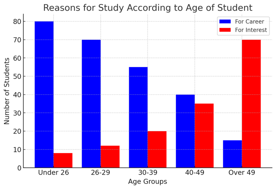
Description:
The bar graph illustrates the main reasons for studying across age groups, highlighting career-driven and interest-driven motivations. Specifically, younger individuals, especially those under 26, primarily study for career advancement (about 80 students). Similarly, this trend continues in the 26-39 age range, though interest-based learning gradually increases. However, by 40-49, both motivations are nearly equal. In contrast, in the 50+ group, personal interest becomes the dominant factor. Overall, younger students prioritize careers, whereas older learners focus on education for personal enrichment.
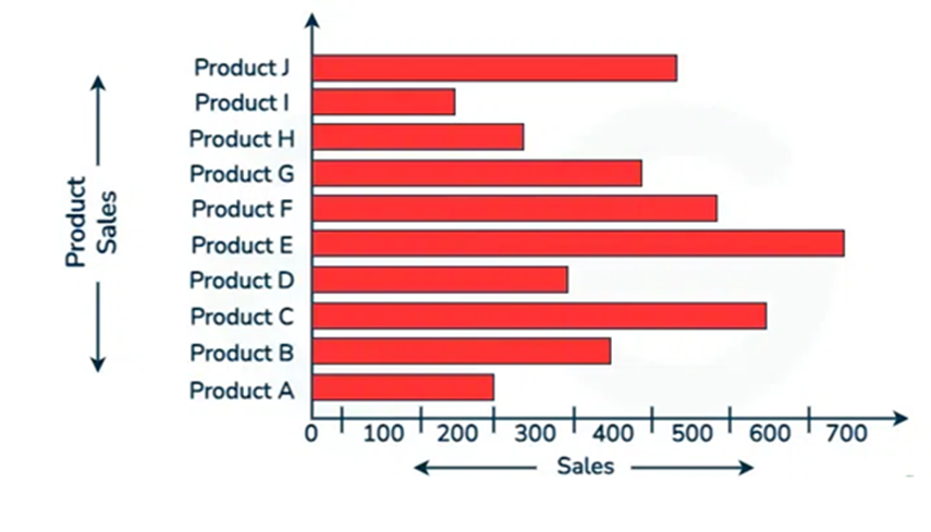
Description:
The bar graph depicts sales performance by products. Notably, the highest sales for Product E was at about 700 units. Similarly, the lowest sales were made by Product I and kept below 200 units. In contrast, Product F and Product B sold products with over 500 units. While Product D and Product H, did moderate sales ranging between 200 to 400 units. Overall, sales varied significantly, with some products outperforming such as Product E, C, J and F with others by a large margin.
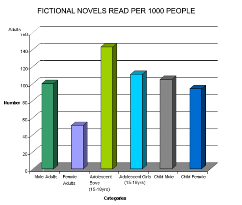
Description:
The bar graph illustrates the number of fictional novels read per 1,000 people across different age and gender groups. Most importantly, adolescent boys between age 15-18 years have read the highest number of novels, exceeding 140. Similarly, adolescent girls also showed more interest as nearly 120 novels were read by them. In contrast, female adults showed the least data, with numbers below 50. Additionally, male adults, child males, and child females show moderate reading habits, ranging between 80 and 110. Overall, adolescents are the most avid readers, while adults, particularly females, read significantly fewer fictional novels.
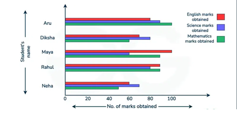
Description:
The bar graph illustrates the marks obtained by five students in English, Science, and Mathematics. Firstly, Maya achieved the highest marks in English, scoring around 100, while Aru outperformed in Mathematics with approximately 95 marks. Moreover, maximum of the students performed better in Mathematics compared to Science and English. Whereas, Neha scored the lowest in English, with about 50 marks and Diksha had relatively balanced scores across all subjects, ranging between 60 and 80. In contrast, Science marks were generally lower, with most students scoring between 50 and 75. Overall, Mathematics appears to be the strongest subject, while Science shows the lowest performance.
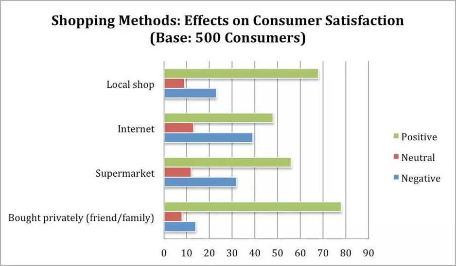
Description:
The bar graph reveals consumer satisfaction with different shopping methods based on 500 consumers. Firstly, who buy privately from friends or family received the highest positive feedback, with around 80 consumers satisfied. In contrast, online shopping had the highest negative response, with nearly 35 consumers dissatisfied. Furthermore, supermarkets and local shops had similar positive ratings, approximately 65 and 70, respectively. However, local shops had fewer negative reviews than supermarkets. Whereas, neutral responses were relatively low for all categories, they were slightly higher for online shopping. To conclude, purchasing from trusted sources like friends or local shops led to greater consumer satisfaction.
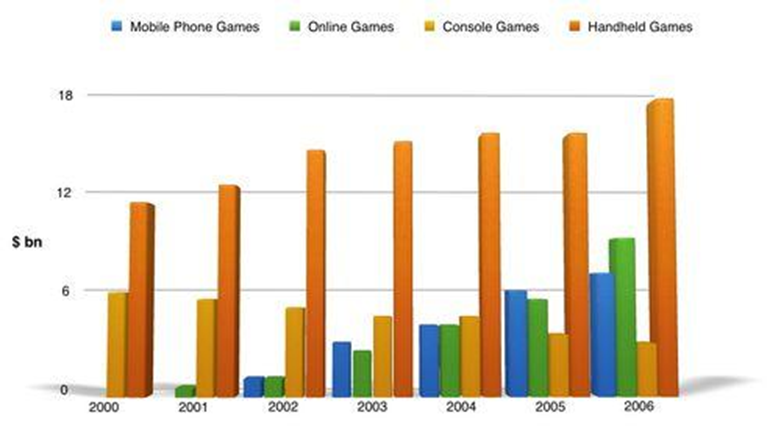
Description:
The bar graph illustrates the revenue trends of different gaming categories from 2000 to 2006. To begin with, handheld games consistently generated the highest revenue, from around $11 billion in 2000 to nearly $18 billion in 2006. In contrast, mobile phone and online games started with minimal revenue but grew steadily, reaching approximately $7 billion and $9 billion, respectively, by 2006. Furthermore, console games saw moderate growth, increasing from $6 billion in 2000 to around $9 billion in 2006. Hence, handheld games remained dominant, whereas mobile and online games gained popularity over time.